|
|
|
PROJECT DESCRIPTION
Project title: Interstellar Racing League Engine: Unreal Engine 4 Development time: 180 hours Team size: 54 developers |
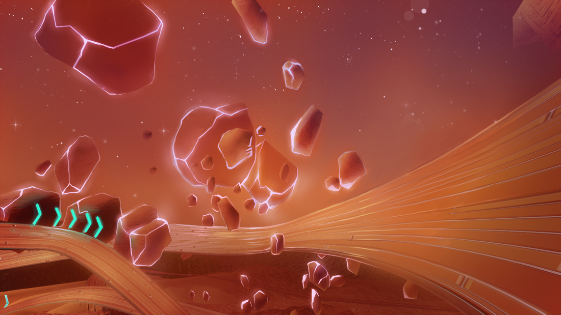
A competitive multiplayer racing game. Challenge the AI (or your friends) on gravity-defying racetracks to earn the title of the galaxy's best racer
|
RESPONSIBILITIES
UI Artist (sole)
Character Artist (sole)
UI Artist (sole)
- Responsible for design and creation, as well as implementation (along with the UI programmer), of all main menus and menu components, as well as single player and multiplayer HUDs (1, 2, 3, and 4 player).
- Oversaw and approved HUD animations, and created the initial base animations for item pickups which could then be used as scaffolding for the rest of the HUD animations.
- Created one master shader material to be modified and used across all UI border elements, as well as the text material for titles.
Character Artist (sole)
- Responsible for creating all four unique characters from concept to final 2D render, and incorporating them into the main menus and HUD.
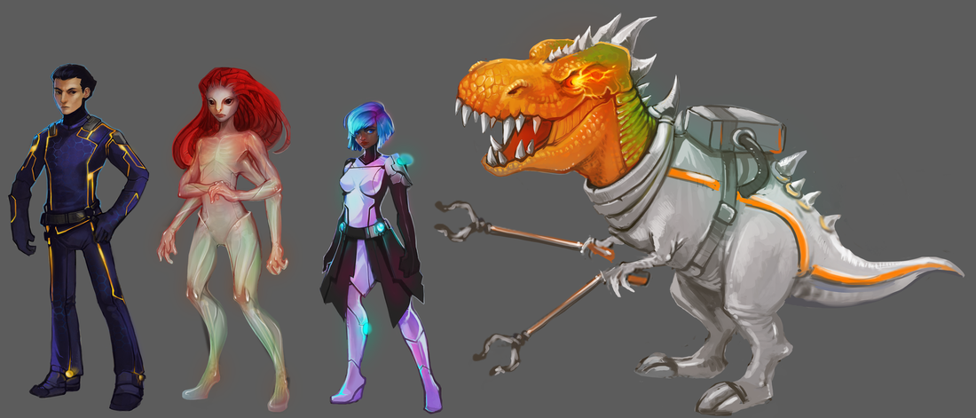
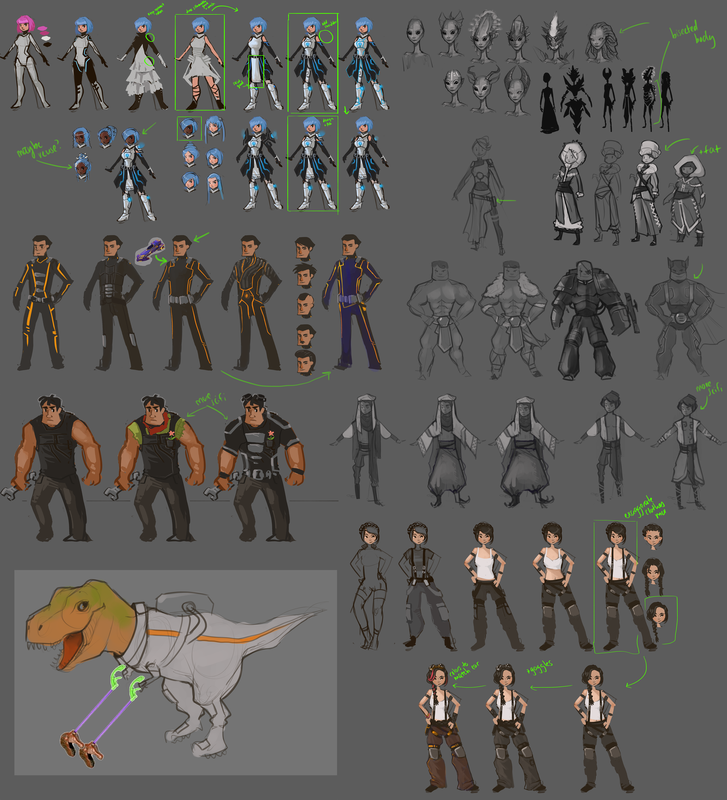
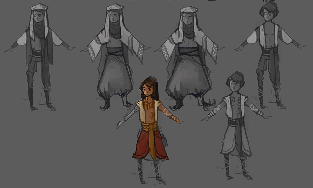
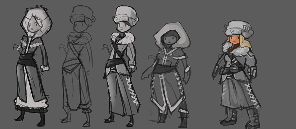
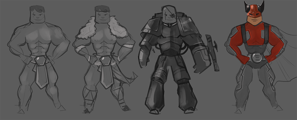
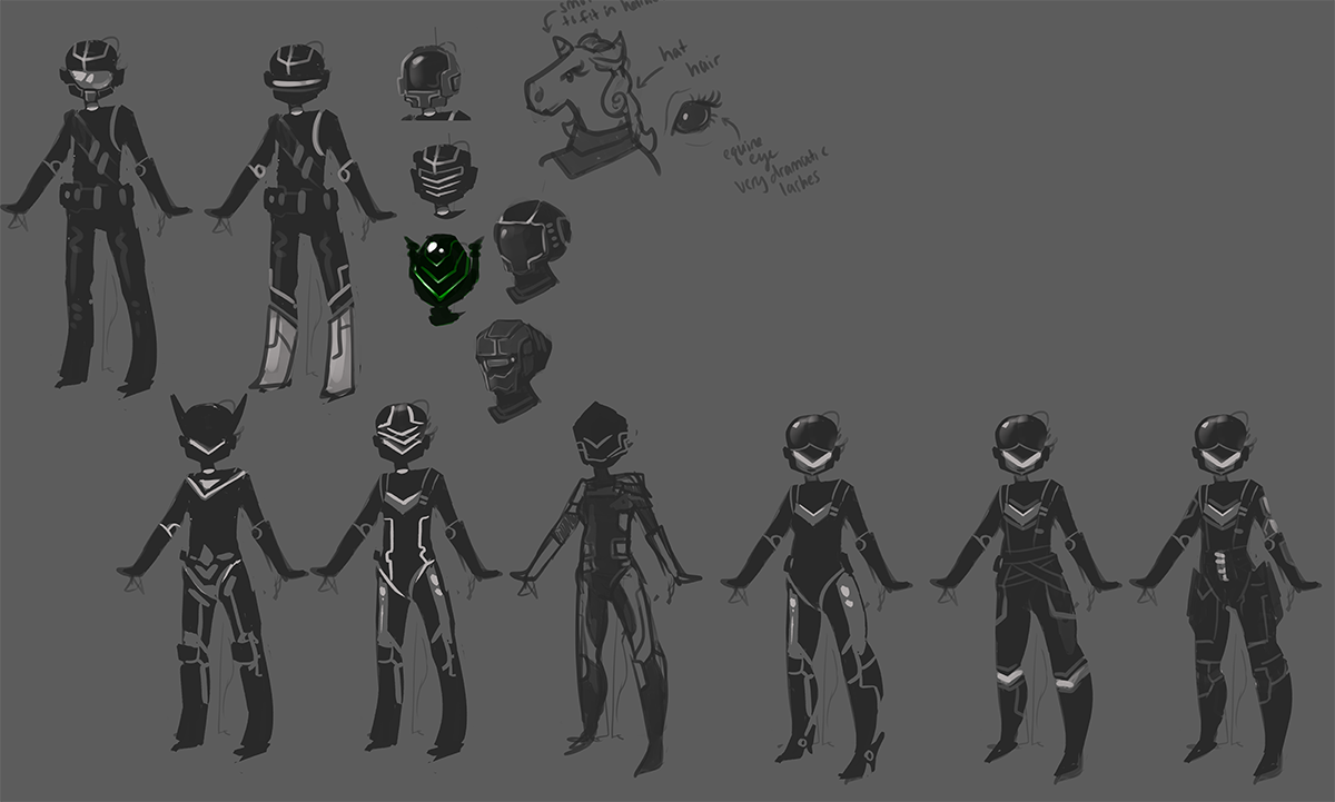
From initial sketches of the characters, we identified aspects that we liked, and continued to refine down to 8 final designs, with the intent to create a widely diverse cast that would reflect the worlds which the player raced through. The original pitch for the levels included a high-tech cityscape planet, a fire planet, an ice planet, and an alien jungle planet, and we tried to incorporate aspects of each into the different characters, as well as including at least two non-humanoids.
|
Many of the earlier character iterations were of a more typical fantasy design. We decided that we wanted all characters to incorporate some hints at living in a higher-tech sci-fi society - a mechanical arm, pieces of body armor, body suits. We also wanted to avoid the obvious stereotypes for each environment that the characters would represent - for example, referencing Russian dress rather than Eskimo. Each character was given a distinctive color palette, which would match their accompanying vehicle, and make them all easily distinguishable from each other. Since the game was very high-speed, players needed to be able to quickly identify characters and vehicles at a glance. This meant no shared hair colors and distinct silhouettes. |
|
At one point, we intended to have unlockable characters which would appear and challenge the player to a race after certain conditions were met. These characters, we decided, should be flashy and dramatic, and emphasize a certain type of our race cars; large and clunky, or small and maneuverable. We had several widely different designs for the large "hero" character before settling on one, however the smaller "mystery" character always had a very strong design - we tweaked it multiple times, however there was very little hesitation on which direction to take her in. Ultimately we cut down to 4 characters due to time constraints. This was the final lineup of character renders, with assistance from Clayton D'Mello (car team Art Lead) for final touches on Bertha (the T-Rex). |
|
|
|
|
|
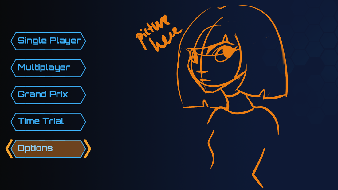
Early prototype sketches for menu and HUD layouts. We focused on using a bright blue for our primary color scheme to ensure that the HUD and menus were consistent with each other while also standing out against the different proposed environments. The track and car teams had decided that they would primarily use warm colors, and the environment would be of more desaturated hues, so the cool blue contrasted well against both.
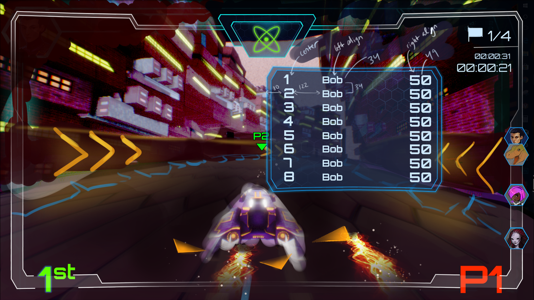
At this point we were concerned with getting all the UI elements on screen quickly to see how playtesters reacted to placement and color, with less concern for how clean or finalized the images themselves were.
At this point in development, we expected players to be able to choose from one of three pickup abilities, with each pickup having "levels" of power that it could be increased by collecting additional copies of that ability.
|
|
Once we decided on a finalized design and generated cleaned up art components, I put together mockups of all the intended menus, along with the pixel measurements of each item so that the layout could quickly and accurately be reconstructed in UMG.
We increased the size of the most essential HUD components (player place and number), as well as moving the pickup icon into a centralized location rather than in the left corner. The pace of the game turned out to be much quicker than we had anticipated, and players rarely looked away from the center of the screen, so we wanted to make sure that the most important information (whether you had a pickup or not, and which one) was displayed somewhere that the player could see it without moving their eyes.
Once I began importing and placing assets in the menus, I realized how much more useful it is to have black and white images, which can then be tinted in engine, rather than relying on colored images. Although bringing in pre-colored sprites gave me more control over exactly what shade and opacity the color would be, this meant that there was also less flexibility in their use, and as a game with four different play modes (1, 2, 3, and 4 player) and color coding associated with each, reusing assets, particularly in the HUD, was far more expedient than creating four different variants of the same asset. This was particularly true whenever a change had to be made to design. We shifted the player colors multiple times across the project to adjust for changes in environment and vehicle design, as well as in response to playtesting.
|
|
|
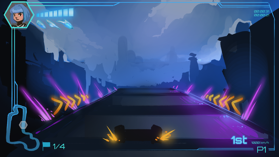
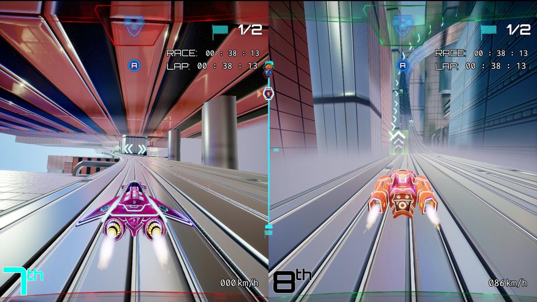
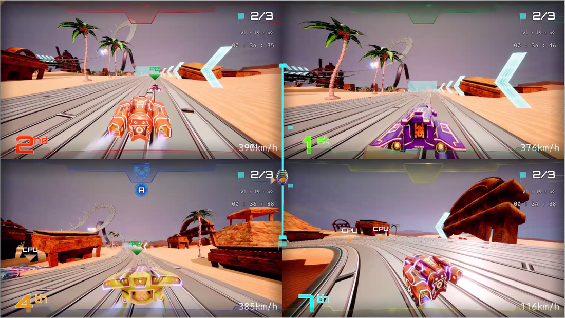
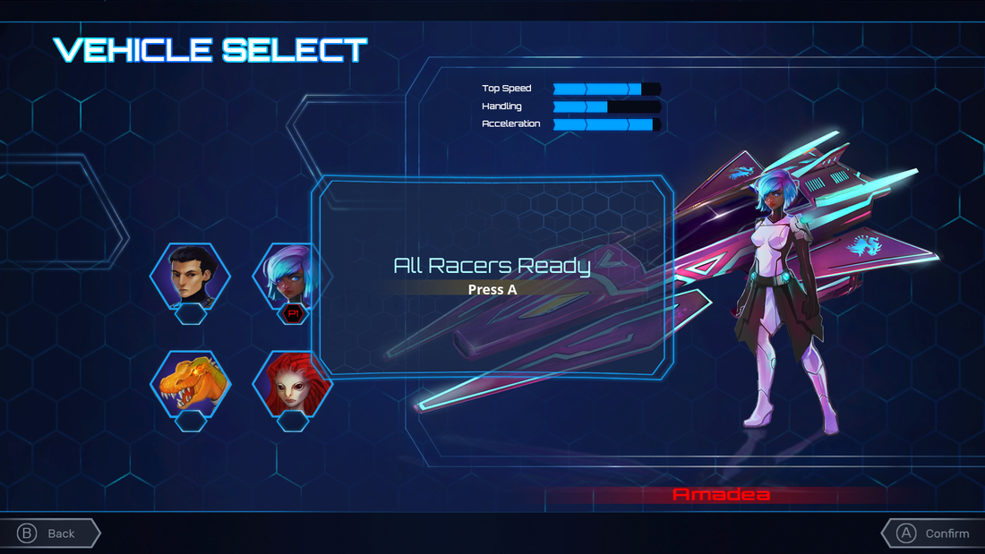
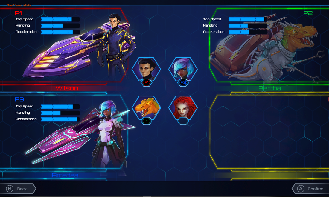
Final in-game screenshots of the 1, 2, and 3/4 player HUDS
|
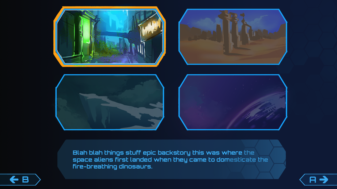
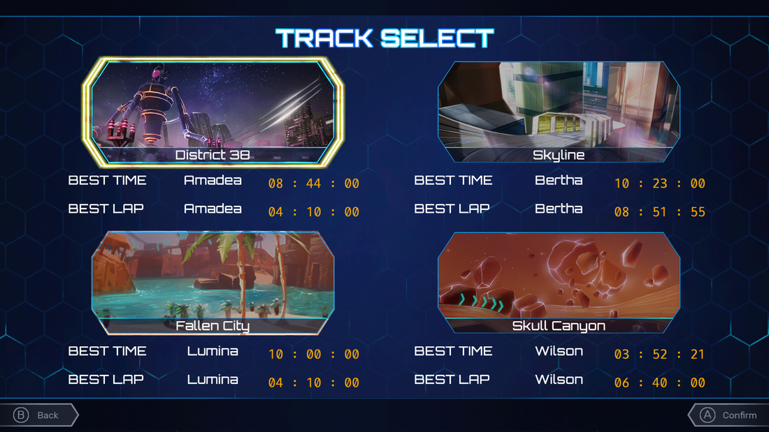
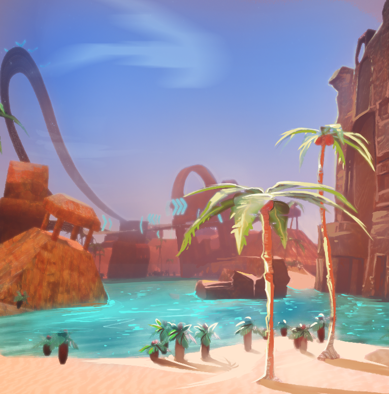
Final in-game screenshot of the track select, as well as the two paintovers which I did (Skyline and District 38 were done by Clayton D'Mello) |
|
|
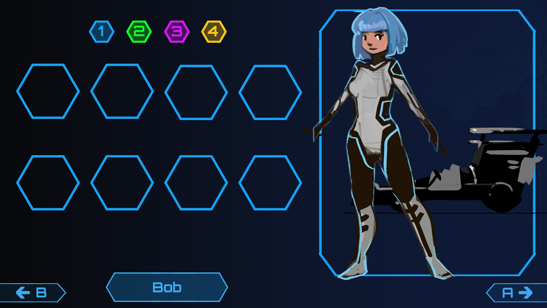
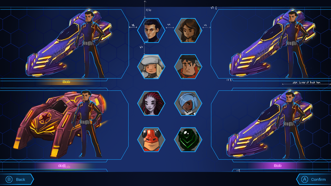
Final in-game screenshots of the single and multiplayer character select screens
|
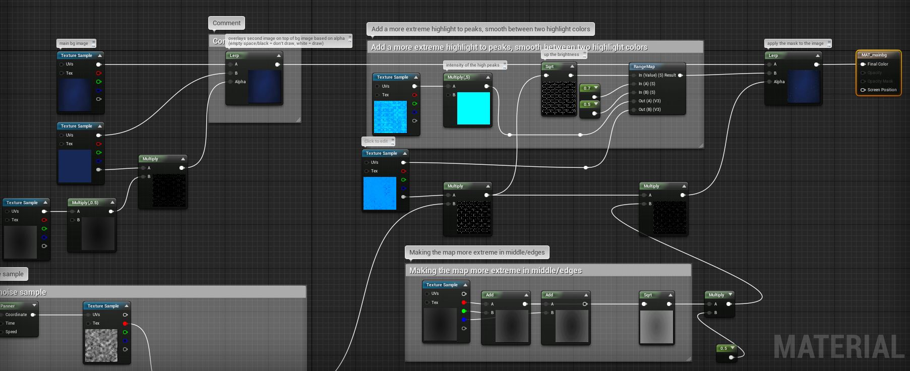
For the menu background material, I used a hexagon pattern as a mask over the background gradient, with panning highlights based on randomized noise, and masked or dimmed out areas depending on the content layout of each page. Earlier, one of our artists had created a looping mp4 which we played in the background, however there were issues with this method; not only was the file large and prone to cause crashing when launching the game, the repeating pattern became quite obvious if you spent much time in the menus. Switching this to a material instead solved both our load time/crashing problems, as well as randomizing the pattern of light movements. |
|
I was then able to take the background material and repurpose it to get the same shimmering hexagonal effect along the in-game HUD. A challenge I did not expect was UMG's restriction on the material outputs which can be accessed. Due to this, I had to teach myself how to convert the effects I wanted (particularly emissive) into the base color. |
|
POST-MORTEM
- As the first UI team for a team game at our school (1 programmer, 1 artist, 1 game designer), we were able to pull together and meet our deliverables while learning how to use UMG with very little outside support
- Having good communication with the game design team was the single largest reason that we were able to succeed. As one of the teams which was most dependent on and interconnected with other aspects of the project, we needed clear lines of communication in order to be able to incorporate all the other teams' functionality into the HUD and menus.
- I became more comfortable working within UMG and blueprint, as well as troubleshooting compiler and variable errors